Corporate CRM
Consolidating multiple legacy tools into one CRM for corporate banking — designed module by module with a custom design system built from three sources.
Context
Corporate banking relationship managers don’t have a CRM problem. They have several CRM problems. A consultant managing a portfolio of corporate clients spends their day across regulatory checks, risk monitoring, scheduled conversations, cross-sell follow-ups, and coordination with internal specialists. Each of those workflows had grown a tool around it over time. None of them quite talked to the others.
The brief — redesign the corporate CRM — was technically accurate but understated. The real job was unifying a patchwork of platforms into a single, coherent product without losing the depth that made each individual tool useful in the first place.
The problem
The legacy “CRM” had three layered issues:
- Built on unsupported components. The old front-end was assembled from a component library that had aged out of support, which made every new feature a risk and every visual update a fight.
- An information architecture nobody could defend. The IA had been added to incrementally for years. New sections sat next to old ones with no consistent grouping. New features literally couldn’t fit — there was nowhere to put them.
- Not one product, but several. This is the most important point. What users called “the CRM” was actually a stack of separate platforms with overlapping data, inconsistent navigation, and different visual languages. The unifying project wasn’t a redesign — it was a consolidation.
The old system was never really one system. That was the real problem.
My role
I joined the project after the strategic vision had been set by another senior UX designer — the information architecture, the major user flows across the product, and the brand direction were already in place. My job from that point was execution at depth: building the design system that would carry the vision into pixels, and designing the individual CRM modules — with their flows, edge cases, empty states, and interaction patterns — module by module as the project shipped.
I worked day-to-day with the PM, the dev lead, and the business stakeholders, with continued support from the senior UX who had set the original vision. Each module went through workshops with business owners, design, prototyping, user testing with real consultants, and iteration based on feedback.
Joining a project after the vision is set isn’t a smaller job — it’s a different one. The work is less about defining what the product is and more about defending what it means in practice across hundreds of specific decisions.
Process
Building a design system from three sources
The bank has a design system. We couldn’t use it. Timing and budget didn’t allow for a custom net-new system either. The pragmatic answer — synthesise what already existed.
The design system I built for this CRM pulls from three sources: Material Angular as the underlying component framework (it matched the dev stack), the bank’s existing component specifications for visual language and behavioural patterns where they applied, and PrimeNG tables for the heavy data-grid work that Material doesn’t do well. The job was making these three sources feel like one product, not a Frankenstein.
That meant decisions like: align Material’s input states with the bank’s interaction patterns, override PrimeNG’s default table styling to match the rest of the UI, and document everything as I went so the next designer or developer touching the system wouldn’t have to reverse-engineer the choices.
Designing the assistant — a task-driven home
The first thing a relationship manager sees when they log in is a list of what they need to do, not a directory of clients. The assistant view is a task-management surface organised around urgency: my priorities, important for the organisation, unassigned. Each task carries the client it belongs to, an end date, and a one-line description of what the consultant actually needs to do.
The structural decision: task type filters (warning / sales / organisational), end-date filters with quick ranges, and saved view configurations so a consultant can return to their preferred slicing of work without rebuilding filters every morning.
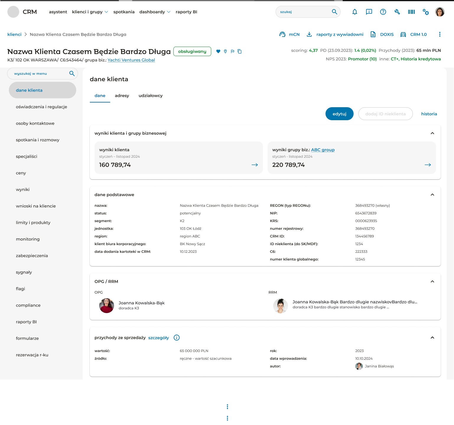
Designing client detail — depth without drowning
A single corporate client has a lot of associated data: financial performance, relationship history, products and limits, risk signals, compliance status, scheduled meetings, BI reports, internal flags. The challenge was making that depth navigable without forcing the user through a wizard or hiding things behind unintuitive groupings.
The left rail in client detail collapses around 17 sections into a single scannable column. Within each section, the page uses collapsible cards as the primary structural unit — basic data, income and revenue, OPG/RRM relationship managers, groups, additional data. Each card opens in place; the user never leaves the page they’re on.
The header surface is dense on purpose. It carries the client’s name, status chip, address, business group, plus a row of business-critical indicators in the top right: scoring, probability of default, NPS classification, credit history flag. These are the numbers consultants check before any conversation — they belong above the fold, not buried inside the data tabs.
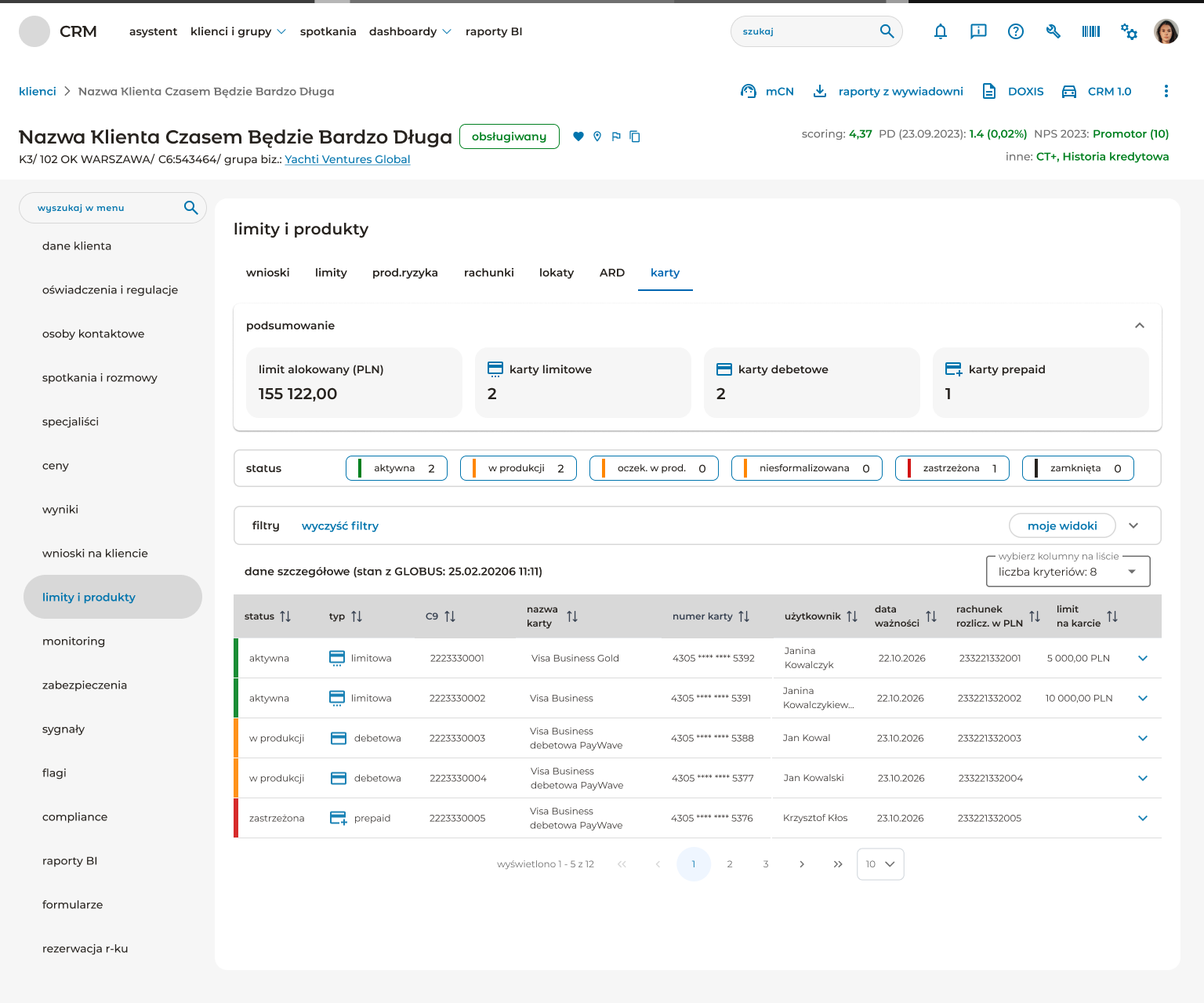
Working with the dev team on data-dense tables
The products and limits section is where the design had to earn its keep on power-user terms. Consultants compare cards, accounts, deposits, ARD positions, and loan applications constantly. The table needs filters, multi-state status visualisation, column configurability, sort indicators on every column header, and inline expansion for row-level detail.
I worked closely with the dev team on this — PrimeNG gave us the table foundation, but the visual language, status patterns, and configurability all had to be designed on top.
User testing on a release cadence
The CRM ships in modules, not as one release. That means user testing is continuous, not a one-off phase. After each module went through design and business workshops, we tested with real consultants — the people who’d use the tool every day. Feedback came back at the level of specific friction points: a status that wasn’t visible enough, a filter that didn’t match how they thought about their portfolio, a label that meant something different in their actual workflow than what the business stakeholder had described.
Those specifics shaped the next iteration. The pattern I learned to trust: business stakeholders are right about what needs to be in the system, but users are right about how it needs to behave.
The solution
A consolidated CRM for corporate banking relationship managers, built on a custom design system, shipping in modules. The architecture has three layers:
- Assistant — a task-driven home that surfaces what each consultant needs to do today, organised by priority.
- Clients & groups — the client list and search experience, with status segmentation and saved views.
- Client detail — a deep, navigable workspace for everything that touches a single client, from financial performance to compliance to product holdings.
The visual language reads as one product, not three. The IA is defensible. New features now have a place to live.
Outcome
The CRM is shipping in modules and is in active use by corporate banking consultants, their managers, and administrators. The reception from users has been positive — these are people who lived in the legacy patchwork, and the move to a coherent product has been welcomed.
The project is ongoing. New modules continue to release on a regular cadence, each going through the same workshop → design → user testing → iteration loop.
What I’d do differently
One main reflection, and it’s specific.
Pair with a design system specialist from inside the bank from day one. The design system I built works — it synthesises three sources into a coherent product — but synthesising those sources alone created implementation friction that a dedicated DS partner would have caught earlier. Specifically: edge cases where PrimeNG behaviour conflicted with the bank’s interaction patterns, places where Material Angular defaults needed overrides that weren’t documented yet, and component variants the bank had standardised elsewhere that I either re-invented or aligned to too late.
Building a design system as a side-effect of designing a CRM is doable. Building one with someone who already lives in the bank’s design system ecosystem would have been faster and more durable.
This is the conversation I’d open earlier next time: not can I have help on the DS? but who at the bank is responsible for this kind of work, and how do we partner from the start?