Mobile payment flow
Refreshing the national payment form in a major Polish banking app — and setting the pattern for SEPA, SWIFT, and SORBNET flows that followed.
Context
The client’s mobile banking app is one of the most-used in the Polish market, and the payment forms inside it carry a lot of traffic — most users pay someone or something through it every week. The national payment flow, the most common transfer type, had aged. Its components were drawn from a previous design system, the recipient selection was clunky, and the visual language no longer matched the rest of the modernised app.
The refresh wasn’t about making it prettier. It was about resetting the pattern for every other payment flow the bank would touch next — SEPA, SORBNET, SWIFT — all built on top of the same form scaffold.
The problem
Paying someone you’ve never paid before is a small, high-trust moment. The form has to be fast, the recipient has to feel correct, and any friction reads as risk. The old flow had three issues compounding:
- Outdated components from a previous design system that didn’t match the rest of the modernised app — visual inconsistency erodes trust in a financial product.
- Recipient selection was buried and inconsistent. Users typing a new recipient had no help, and users wanting a saved one had to context-switch out of the form.
- The form had grown layered over the years — small additions like “change to standing order,” cross-sells, and disclaimers had piled up at the bottom in ways that crowded the primary action.
Whatever I designed had to solve all three, fit on a single input screen, and work as the foundation for at least three other payment types.
The most useful detail in this form is what happens when the autocomplete doesn’t find a match. The user keeps going.
My role
I was the sole product designer on this flow. I worked day-to-day with a PM and the development team, and in regular workshops with the business owners. For the recipient picker specifically — a new component variant that didn’t yet exist in the design system — I worked with the bank’s design system team to shape what we’d need. Senior designers from adjacent app areas joined some workshops to keep the new pattern consistent with what was happening elsewhere in the app.
What I did not own: the design system itself (I contributed back), the underlying payment infrastructure, or the eventual SEPA/SORBNET/SWIFT extensions (those came later, built on top of this pattern).
Process
Benchmarking, and where I disagreed with the result
The benchmark across European and Polish banking apps was clear: payment input is almost always split across multiple screens — recipient on one, amount on the next, confirmation last. There’s good reason for this. Each screen confirms the user is on the right path; mistakes are caught earlier; the cognitive load per screen stays low.
The business wanted a single input screen. The argument was speed — a returning user paying a known recipient should finish in seconds, not three taps. The argument is defensible. I designed for it, but flagged the trade-off explicitly: this constraint would make the form dense, and density is where errors hide.
This is the call I’d undo if I could — more on that below.
Managing density: progressive disclosure on a single screen
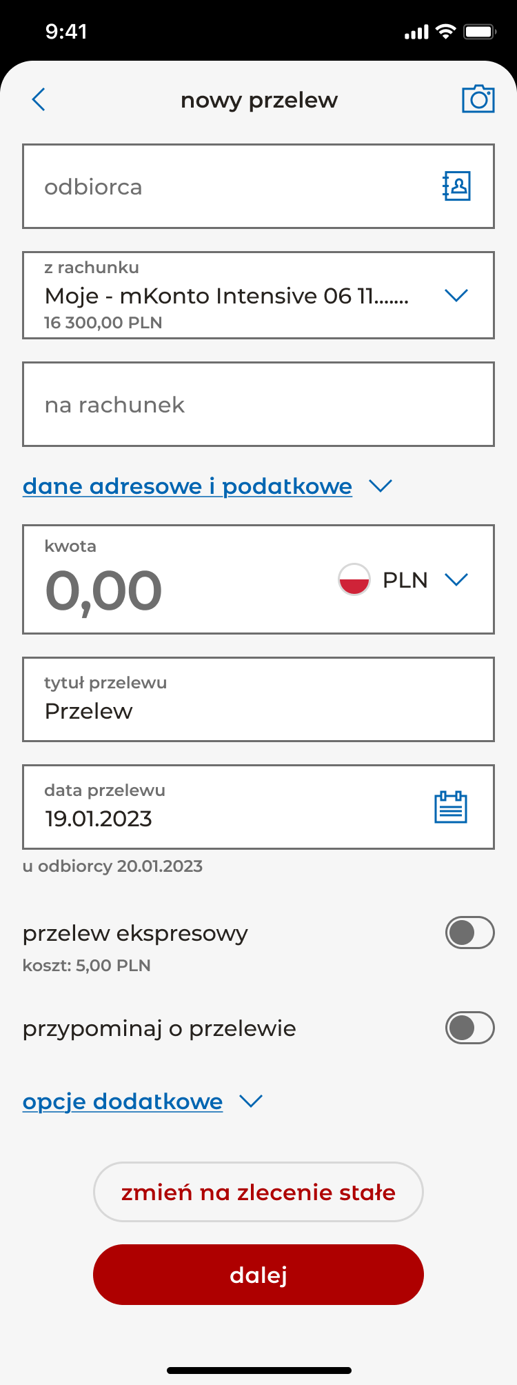
If the form has to fit one screen, the answer can’t be “shrink everything.” It has to be “show only what matters now.” Two sections collapse by default: address and tax data, which most users never touch, and additional options (add to address book, send email confirmation), which sit below the main flow. Each header shows a clear chevron and opens in place — the user never leaves the form, never loses their context. The visible form stays focused on the seven decisions that actually drive a transfer: who, from where, to where, how much, what for, when, and how (express vs standard).
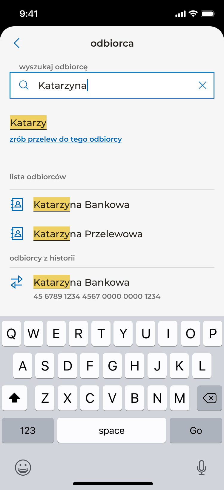
Designing the recipient picker
The most-discussed part of the form was how a user selects who they’re paying. The old flow forced a choice between two modes: type a new recipient, or navigate to a separate list of saved ones. Most users do a mix — they vaguely remember the person, want to type a few letters, and want the system to help if it can.
The redesigned picker is a single input with an icon that opens a searchable list of saved and recent recipients. The list filters live as the user types. The detail that matters most: the moment the user starts typing, an action surfaces directly under the input — “zrób przelew do tego odbiorcy” (“make a transfer to this recipient”) — letting them commit to exactly what they typed, even before autocomplete suggestions appear. If the name they want isn’t in their history, they don’t get stuck. They just keep going.
This sounds small. It’s the kind of decision that gets argued about for a week in workshops and disappears into the form once shipped. But it’s the difference between a picker that helps and a picker that traps.
Working with the design system, not against it
The recipient picker wasn’t a stock design system component. Rather than reinventing it as a one-off, I worked with the design system team to shape a new variant — one that could serve this form and the future SEPA/SORBNET/SWIFT versions. That meant designing the component’s behaviour for cases this form didn’t immediately need (international account numbers, IBAN validation, BIC codes) so the next designer wouldn’t have to rebuild it.
This is the kind of work that doesn’t photograph well in a portfolio but matters at senior level. A component that ships once and breaks the next time it’s used is worse than no component at all.
Cross-team design reviews
Several senior designers from adjacent areas of the app joined the later workshops. Not to approve the work, but to keep it coherent with what they were doing in their own flows — making sure a recipient picker here would feel like a recipient picker elsewhere, that error states matched, that secondary actions sat in consistent positions. This is what design quality looks like inside a large app: not a single designer’s taste, but a series of small alignments across many designers’ surfaces.
The solution
A single-screen national payment form built from refreshed design system components, with the recipient picker as its centrepiece. The visible form contains, in order: recipient, source account, destination account, amount, transfer title, transfer date, express-transfer toggle, and reminder toggle. Two secondary sections — address/tax data and additional options — collapse by default. The standing-order action sits at the bottom of the form alongside the primary “dalej” (continue) button.
A few smaller decisions earn their place:
- Below the amount, a one-line “after this transfer you’ll have X remaining” readout. Tiny detail, big trust signal. Users see the consequence of what they’re about to do before they commit.
- The source account always shows current balance inline, so the user doesn’t need to mentally context-switch to verify.
- The date picker defaults to today but exposes the recipient’s receipt date below (“u odbiorcy 20.01.2023”), making clear when the money actually arrives.
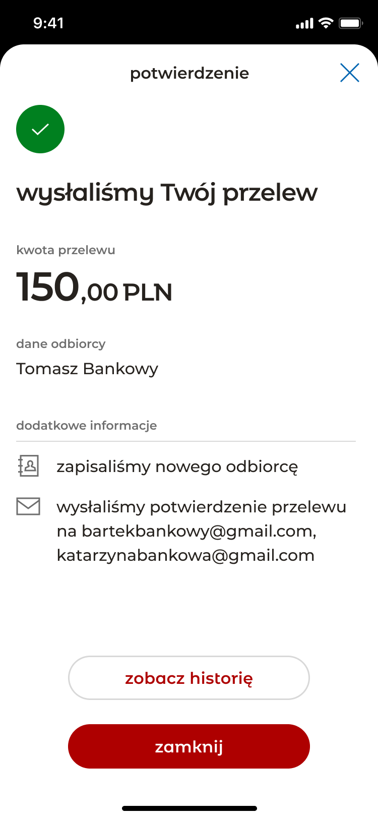
The full flow continues across additional screens — summary, PIN authentication, success — following the bank’s standard authorisation pattern. The single-screen constraint applied to the input form specifically, not to the flow as a whole.
The form shipped. The component patterns set here were then used as the foundation for the SEPA, SORBNET, and SWIFT flows that followed.
Outcome
The flow shipped to production in the bank’s app in 2025 and is the active national payment experience used by the bank’s mobile customers. The recipient picker pattern and the form’s overall component scaffold became the template for the bank’s other payment types — SEPA, SORBNET, SWIFT — which were built on top of the same foundation.
No quantitative outcome data is available to share publicly. The honest version: I shipped a high-traffic, high-trust form into a top-tier banking app, it became the pattern other payment flows extend, and it’s the active experience millions of users hit every week.
What I’d do differently
Two things, both honest.
-
Push harder on the multi-screen split. The benchmark was clear. Even with progressive disclosure, the single-screen constraint made the form dense in places it shouldn’t be. A returning user paying a known recipient could absolutely complete the flow in seconds across two clean screens; the speed argument doesn’t require density. If I were starting over, I’d prototype both versions, test them with real users, and bring data — not just principle — back to the business.
-
Move “change to standing order” out of the bottom action area. Right now it lives near the primary action, which competes for the user’s eye at the exact moment they’re committing to send money. It should be a mode selector at the top of the form: one-time payment / recurring. That reframes the whole form’s purpose up front and lets the bottom be purely about confirmation.
The form is good. With those two changes, it could be very good.